


Designer Elma Aquino explains how the cover of the October issue took shape after the images had been chosen
Cover lines
The cover lines and position of the text is just as important as
the cover image. The following elements had to be included:
headline; guest editor Steven Isserlis; standfirst consisting of a
brief description of the headline story; a list of contributors;
and a special edition stamp. It was important that each text
element stood out, and also allowed the eye to travel freely around
the page. The size, weight and position of typography helped to
create this.
One of the major problems I was faced with was getting the text to
stand out from the black-and-white image behind it. Subtle shadows
behind the type and boxing out various elements of text helped give
it prominence. Varying the typography broke down the key important
words in the headline ‘Great players’ and ‘of the past’. I
experimented with the positioning of text, which is aligned to the
left at the bottom of the page in Example 4 (a and b), and centred
along the middle of the page in Example 3.
The cover line for our guest editor Steven Isserlis was the next
eye-catching point. This had to look different. I experimented with
incorporating ‘guest editor’ and ‘special edition’ in place of the
three cover lines across the top of The Strad logo (Example 3), but
in this position they didn’t stand out and could easily be missed.
The words had to stand out somehow, and I had to create a device
that would separate itself from the norm. The diamond shape allowed
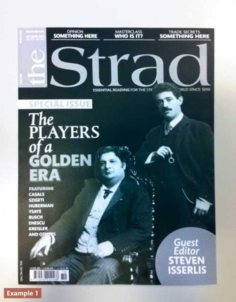
this. I tried a circular device shown in Example 1, but it didn’t
have that edge I needed – it might have come across as a sticker,
and could be seen as an afterthought. The diamond shape gave the
cover a dynamic feel. The solid, full-colour block draws the
reader’s attention and is incorporated within the design. The
position of the diamond device was important, too. It depended on
where the headline, standfirst and contributors’ names were
positioned on the page. I tried some alternatives (see Examples 2
and 4), with the diamond element on the right and along the bottom.
The former wasn’t successful, as the diamond looked as though it
was floating and needed something to anchor it, whereas the latter
looked comfortable at the bottom, as the diamond didn’t cover any
important details on the image behind. Having the diamond at the
bottom also separated out the elements from each other.
The standfirst and contributors’s names were the next elements to
add. Both texts are in list format, so I wanted to differentiate
between them in different styles. Examples 3 and 5 show the
different alternatives. Example 2 shows the standfirst and
contributors in a similar, centred format. Although the type looked
comfortable, the standfirst is quite far from the headline, caused
by the clefs of the f and p. The similar font style and separated
bullet points could also be mistaken as part of the contributors’
text that runs along the bottom of the page. Example 5 shows that
by listing the standfirst and running contributors along the bottom
of the page with bullet points, this breaks up the names and
separates the two elements clearly. The eye can travel around
comfortably and group together the headline and standfirst away
from the contributors information along the bottom.
‘Special edition’ is the text that sums up the whole cover. The
positioning and size of this text did not necessarily need to be
big or dominant over all other headlines, though. As can be seen in
Example 3, I tried ‘special edition’ across the top of The Strad
logo but it failed to stand out. It looked more comfortable with
‘special edition’ above the headline (Example 5). The serif italic
font is not intrusive in size and allows the ‘special edition’ to
stand alone without it being confusingly read on as part of the
headline.
Colour
Colour plays an important part in the design, bringing the elements
alive and highlighting text and images. Because the images were
black and white, it was vital to get some colour on to the cover,
but it needed to be applied accurately. There is a tendency to add
a mixture of colour pallets or to over-highlight. This could begin
to look fake and distract the eye. I wanted to limit myself to two
to three colours for reasons of simplicity and clarity. I wanted
the background to be in one colour and the cover lines in another.
Example 2 shows a grey-gradient-coloured background with red text
as a dominant colour. Although the background was in our usual
gradient style, it left the cover looking flat and the figures
ghostly. The red brought out the text and added colour to the
cover, but because red is quite a safe colour and doesn’t push
boundaries, I tried alternatives. Darkening the background to black
gave a classic feel and balanced the lighting of the
black-and-white figures on the cover. Examples 4a and 4b show the
experimentation of silver and gold colours. The two striking
colours make the text stand out and also complement the images. It
came down to a decision between silver and gold. Gold gave a grand
feeling and implied the golden age, but as Steven Isserlis writes
in his ‘Welcome’ message on page 5 of the magazine, he didn’t want
to confuse a golden age with the first half of the 20th
century:
‘Whether or not the players featured represented a true “golden
age” is hard to say, since it is impossible to judge how players
before them – Corelli, Boccherini, Popper, Paganini, Wieniawski,
Joachim in his prime, and so on – sounded. I feel very strongly,
however, that the first half of the 20th century was an era in
which musicians in general had (and were encouraged to have) a
broader, more holistic approach to music than is customary
today.’
Silver was equally striking and complemented the black-and-white
images. It was a first for The Strad. The use of silver enhanced
the classic feel of the cover.
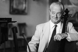
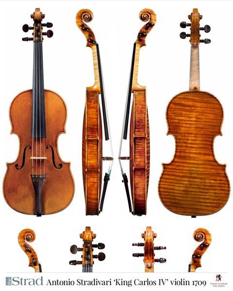
Example 5 is our final October cover, and it’s a tribute to eleven
great players of the past. Although I was not able to create a
sense of real interaction between the players, their individual
photographs with their unique poses and facial expressions set them
apart from each other. With the careful positioning of text and
variations in typography, and with the black, white and silver
colours, everything comes together to reflect on a classic era in
string playing.
Click here to go back to Part One.
Read more about the October issue here, or click here to find out how to download your copy as part of a 30-day free trial. Subscribe to The Strad here


No comments yet