


Designer Elma Aquino reveals the detailed thinking that took place and the decisions made in putting October's unusual cover together
This month we had the privilege of working with the great British cellist Steven Isserlis as guest editor. The theme of his October issue was ‘great players of the past’, and for me as a designer, this was an exciting concept to work with. I was faced with the challenge of working with early 20th-century black-and-white single-portrait photographs, and unusual cover lines, while also drawing attention to the guest editor. I knew the cover would be different from any other we had designed in the past.
Images
We had a magnificent array of photographs of eleven great players of the past – Casals, Szigeti, Huberman, Ysaÿe, Busch and the Busch Quartet, Enescu, Kreisler, Tertis and Koussevitzky. Each black-and-white photograph had a story to tell, and the subjects’ postures, smart suits and elaborate backdrops reflected their personalities and characters. Choosing a photograph for each player, as well as one that would bring all the players together on the page, proved tricky.
When designing layouts, and especially covers, it is essential that there is at least one focal point, which might be a shape, photograph or piece of typography, and all elements must work together harmoniously on the page. There is a danger of cramming too many elements on a page, causing the eye to wander and be less engaged. Our usual cover format would involve The Strad’s logo, cover lines and a striking image. This issue is about eleven great players, but we were limited with the number of players that we could fit on the page, as each one of them would be fighting for attention.
I was also faced with the challenges of the subjects’ lighting in each photograph. Not all photographs had the same source of light coming from the same direction – for example, particular areas of their faces were lit more brightly than others. I envisaged an ideal cover where I would be able to direct the positioning of all eleven players in a grand hall of their era, to be in control of the room’s lighting, and to be able to capture real interaction between the great players. However, this was of course impossible to create today.
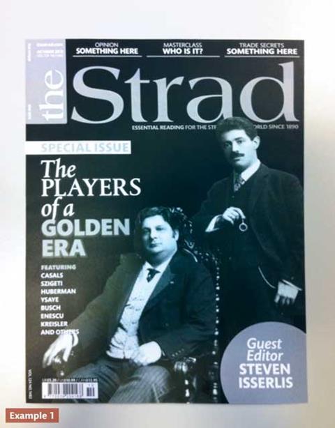
In the same vein, editor Ariane Todes, and I found an image of Kreisler and Ysaÿe sitting together in a photo shoot with a third man whom we couldn’t identify. The composition of the three figures created balance on the page, with Ysaÿe in the middle, Kreisler on the right and the unknown man on the left. But it wouldn’t have made sense to have an unknown and perhaps unrelated figure on the cover, so we decided to take him out completely, creating space for our cover lines. Example 1 shows this image. Although the concept was ideal, the cover looked too staged and static. Ariane and I therefore narrowed down the eleven to three or four great players – Kreisler, Casals, Ysaÿe and Thibaud. We found images of each of them with their instruments and in standing positions, which would help fill the page equally.
The next decision was the positioning of the three chosen players’ images on the page. Their posture, stance and eye contact played an important part in this. We’re more engaged as readers with photographs that have eyes looking straight at us. The three photos shown in example 3 show three players positioned in such a way as to complement each other. By positioning Kreisler in the centre of the cover with his eyes looking at the viewer, his open stance and relaxed, friendly facial expression immediately draw the viewer in. Casals’ position is slightly turned to the right, with a reflective facial expression turned slightly away from the viewer, and with his cello on view. His posture suited a position on the right – if he’d been positioned on the left his cello would have been hidden behind Kreisler’s arm.
Ysaÿe completed the composition on the left, with a straight stance. However, we were unsure of Ysaÿe’s rather distant facial expression. His image was less engaging compared to the images of Kreisler and Casals. Rooting through our archive we found a cheerful image of Thibaud to replace Ysaÿe. Thibaud’s expression was somewhat mischievous and inviting, exuding character, and it had the eye contact we needed. However, his posture in the photograph was problematic. Thibaud had his arm leaning on a piano, which looked as though he were dancing – quite confusing without the piano. This was a photo we were determined to use, however, so by sculpting his arm in the photograph to look more relaxed, I experimented with his position behind Kreisler, and it finally all came together.
It would have been ideal to have had Casals in the middle as he is a well-known player, but as you can see in Example 2, Casals’ position with his back turned away from Ysaÿe and Kreisler’s eyes looking straight out to the reader looked uncomfortable.
Click here to read Part Two.
Read more about the October issue here, or click here to find out how to download your copy as part of a 30-day free trial. Subscribe to The Strad here


No comments yet